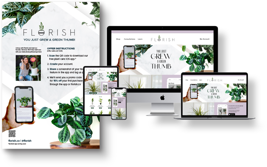
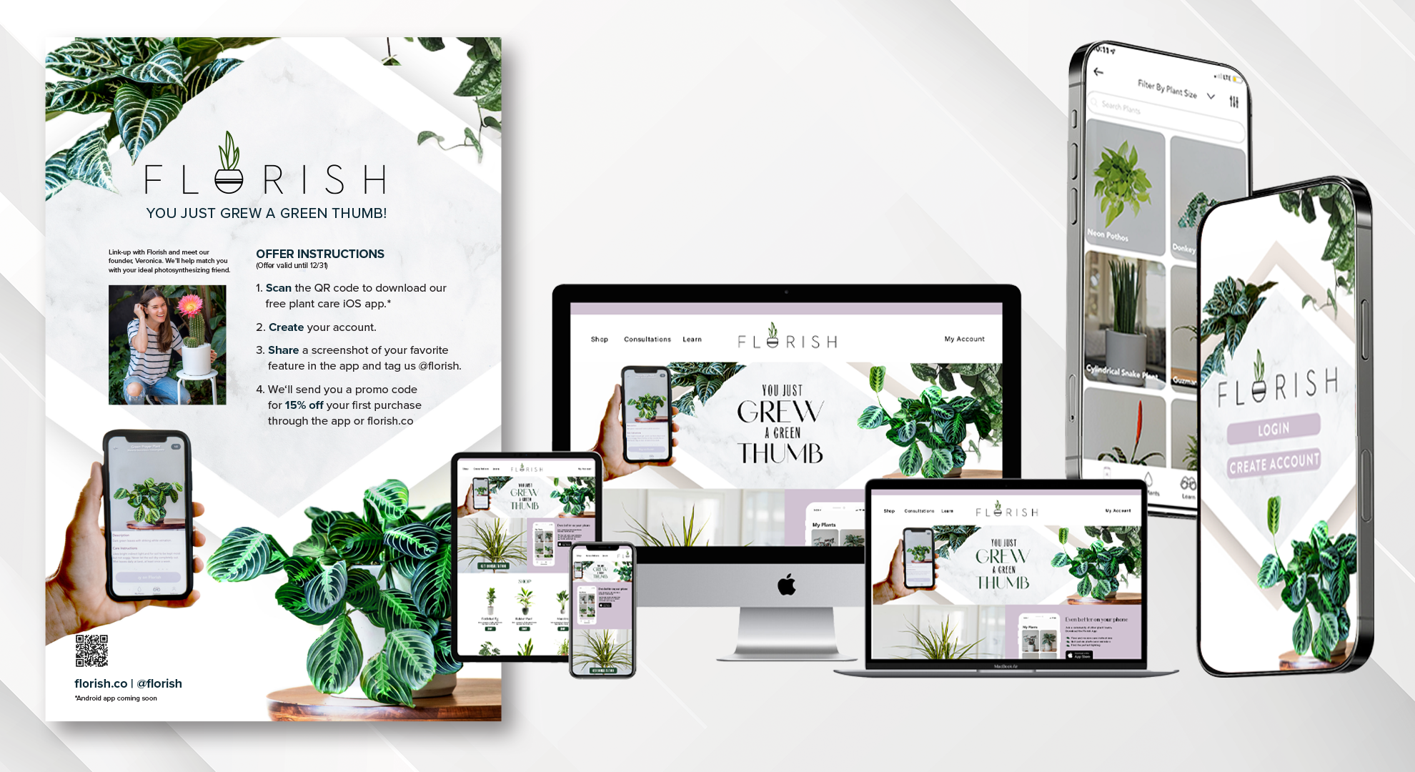
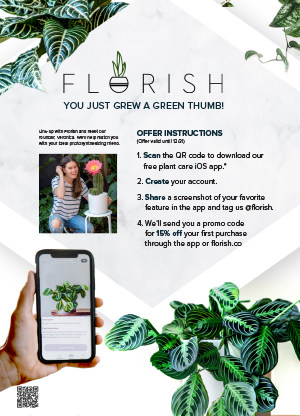
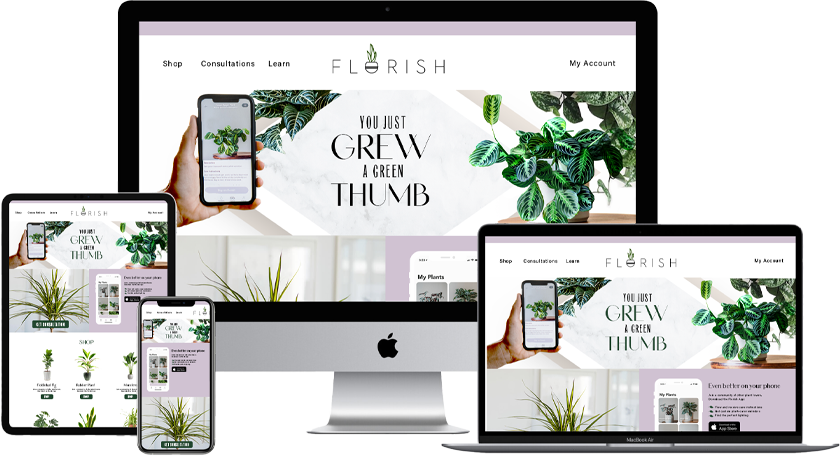
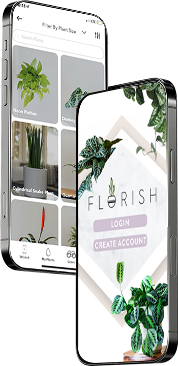
We designed Florish as a visual translator between people and their plants. Using plant recognition and health diagnostics, the app delivers clear, plain-language guidance—what’s wrong, why it’s happening, and what to do next—without overwhelming users. The experience prioritizes clarity, calm, and trust, helping users feel capable rather than corrected.